How to combine decorative vases in a modern living room
A well-chosen decorative vase can transform a dull corner into a focal point with character. But placing a beautiful vase isn't the same as knowing how to combine it. The difference between a composition that looks straight out of a magazine and one that says "I put some things here to see what happens" comes down to a few rules nobody teaches you when you buy the vase.
If you have a modern living room —or want it to look like one— and don't know where to start, here's a practical guide with real criteria for proportion, material, colour and placement. No magic formulas, no endless shopping lists: just what works.
The rule of odds: why three vases work better than two
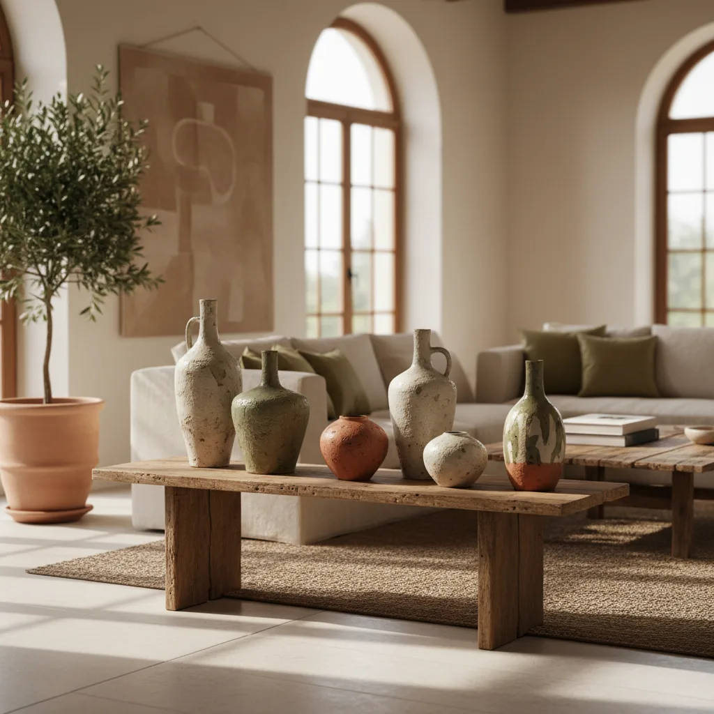
You've probably heard about the rule of odd numbers in decorating. It's not an aesthetic whim: your brain processes odd groupings as more dynamic and natural. Two identical vases create rigid symmetry; three create visual tension, movement, something the eye wants to keep exploring.
The application is simple. Choose three vases that share a common thread —it can be the material, the colour or the family of shapes— but that differ in at least one dimension. The most classic example: three ceramic vases in similar tones but different heights. That controlled variation is what turns a group of objects into a composition.
Does that mean you can't use two or four? No. But if you're just starting out and want a safe result, three is your number. One tall piece, one medium and one short. Just that straightforward.
Materials that combine (and the ones you shouldn't mix)
A vase's material defines more than it seems. It doesn't just change the look: it changes the visual texture, the perceived weight and the temperature of the corner where you place it. Choosing the right material is halfway to making the combination work.
Ceramic: the most versatile option
Ceramic is the wildcard material. A ceramic vase in a matte finish absorbs light rather than reflecting it, which gives it warmth and presence without competing with the rest of the living room. Artisanal finishes —with slight irregularities, reactive glazes, tactile textures— bring that touch of authenticity that plastic imitating ceramic never achieves.
In a modern living room, ceramic works especially well in neutral tones: off-white, sand, stone grey, soft terracotta. If you want to go a step further, look for pieces with artisanal Italian glaze, where each piece has unique variations in tone. That's not a defect: it's the mark of a real process, made by real hands.
Crystal and glass: transparent elegance
Glass brings lightness. A blown glass vase doesn't compete for attention: it lets light through, blends in effortlessly and allows the contents —flowers, branches, even emptiness— to take centre stage. The key to combining it with ceramic is not to overdo it: one glass vase between two ceramic ones creates a contrast of textures without visual clutter.
The mix you should avoid
Mixing more than three different materials in the same composition is risky. Ceramic, glass and metal can coexist if they share a colour palette. But adding wicker, resin and plastic to the same group creates noise. Each material speaks a language; if there are too many languages at once, nobody understands anything.
| Material | Main advantage | Best combination | Avoid with |
|---|---|---|---|
| Matte ceramic | Warmth, texture | Glass, metal | Plastic, glossy resin |
| Crystal/glass | Lightness, light | Ceramic, wood | Wicker, dense opaque materials |
| Metal (brass, matte black) | Contrast, modernity | Ceramic, glass | Metal of a different finish |
| Artisanal stoneware | Authenticity, visual weight | Linen, wood | Very polished surfaces |
How to choose the colour palette without going wrong
Colour is where most people get lost. Not because they lack good taste, but because they try to coordinate the vases with too many elements at once: the sofa, the curtains, the cushions, the rug, the picture on the wall. The result: paralysis or, worse, a composition that looks like a sample book.
The rule that works is simpler than you think. Pick a dominant tone in your living room —the one that covers the most surface— and choose vases in the same colour family but at a different intensity. If your living room has white walls and a grey sofa, vases in sand tones, pale terracotta or sage green will create soft contrast without harshness.
For a modern living room, neutral tones are the safe bet: warm whites, greys, matte blacks, earthy tones. But "neutral" doesn't mean "boring". A matte black vase next to an off-white one and a third in terracotta create a composition with depth and character, without any colour shouting.
If you want to introduce a touch of colour, do it with a single piece. A vase in cobalt blue or forest green between two neutrals works as an accent. Two strongly coloured vases already compete with each other.
Where to place vases in the living room: the five zones that work
It's not enough to choose the vases well. Placing them in the wrong spot ruins the composition. These are the five locations that work best in a modern living room, ranked from most impactful to most subtle.
The sideboard or console
It's the natural place for a vase composition. A long, clear surface gives you room to play with heights and spacing. Place the vases at one end or in the centre, never spread out at equal distances across the whole surface. Leave air between the pieces: empty space is also part of the composition.
The coffee table
Here the rule changes. On the coffee table, the vase competes with books, candles, trays and everything else you end up leaving there. Use a single low, wide vase, or a compact group that doesn't exceed 25 cm in height. If it's taller, it will block the conversation —literally— between those seated on the sofa. If you're looking for ideas to create compositions on the coffee table, the guide on what to use as a table centrepiece will give you more perspective.
Shelves and ledges
Vases among books break the linearity of a bookcase and add three-dimensional volume. Small and medium pieces work here. A trick: place a vase in front of a group of upright books to create depth. And don't put a vase on every shelf; alternate with other objects or, simply, with empty space.
Corners next to the sofa
A large floor vase —50 cm or more— next to the arm of the sofa fills a gap that would otherwise be dead. It's a solution that works especially well in living rooms with few pieces of furniture, where empty corners amplify the feeling of coldness.
The mantelpiece or focal shelf
If you have a mantelpiece, it's the perfect stage for a balanced composition. Three vases of staggered heights, centred or slightly shifted to one side, with a mirror or picture behind that multiplies the visual depth.
large Italian ceramic floor vase
Compositions that work: three proven formulas
Let's get practical. These three composition formulas are easy to replicate and hard to get wrong.
The "staggered trio" formula
Three vases of the same material, three different heights (for example: 15, 25 and 35 cm). Same colour or tones within the same family. It's the safest composition and the one that works best on sideboards and consoles. If one of them holds flowers or dried branches, make it the medium or tall one —never the small one, which looks out of proportion.
The "texture contrast" formula
Two ceramic vases and one glass. Or two matte stoneware and one metal. The idea is for two pieces to share character and the third to bring contrast. This composition calls for the "different" vase to be the one in the middle in terms of height, so the eye registers it as a point of interest, not as a mistake.
The "single statement piece" formula
Sometimes a single vase is enough. If the piece has enough presence —a special glaze, a sculptural shape, a generous size— it doesn't need company. Place it where it has a clean background: a plain wall, a clear shelf. Minimalism works when the piece deserves it. If you're interested in exploring the difference between minimalism and maximalism in decorating, that article will help you define your style.
Common mistakes when combining vases (and how to avoid them)
Knowing what works is useful. Knowing what doesn't saves time and frustration.
Buying identical vases. Two exactly identical vases in the same composition create flat symmetry. If you really like matching pieces, separate them: one at each end of the sideboard, not together. But for grouped compositions, variation is what brings them to life.
Ignoring the scale of the furniture. A 10 cm vase on a two-metre sideboard looks lost. And a 40 cm vase on a narrow shelf looks about to fall. The proportion between the vase and the surface it rests on is as important as the proportion between vases. As a guideline, the composition should occupy between a third and half of the length of the surface.
Overloading with flowers. A huge bouquet in every vase turns the living room into a florist's. If you use flowers, let only one or two vases hold them. The rest can be empty or with a discreet dried branch. An empty vase isn't incomplete: it's a sculptural piece that works on its own. In fact, the trend of using vases without flowers is gaining ever more momentum.
Mixing extreme styles. A rustic clay vase next to an ultra-modern glass one creates a dissonance that few spaces can absorb. If your living room is modern, keep all the vases within that language. The variation should be subtle: textures, finishes, shapes. Not opposite decorative languages.
Placing them against busy walls. If the wall has patterned wallpaper, large pictures or a photo gallery, the vases compete for attention. Look for clean backgrounds where the pieces can breathe.
Italian vases: what sets them apart
When we talk about ceramic vases with character, the Italian ceramic tradition has centuries of advantage. It's not marketing: it's history. Regions like Tuscany, Umbria and Emilia-Romagna have produced decorative ceramics for generations, with glazing and moulding techniques that industrial production lines don't replicate.
An authentic Italian vase stands out for details that don't appear on a marketplace spec sheet: the weight of the piece in your hand, the slight variations in tone between units (because the glaze reacts uniquely in each firing), the finishes that age well rather than deteriorate. Brandani, for instance, has been designing tableware and décor pieces for over 75 years, balancing artisan tradition and contemporary design.
That doesn't mean every expensive vase is better. It means that, if you're looking for a piece that really adds something to your living room —a character you won't find repeated in every house on the street— Italian design ceramics are one of the most solid options. Especially if you can access the full catalogue of brands like Brandani through an exclusive importer in Spain such as Vita Italian Living, with service in Spanish and nationwide delivery.
Quick checklist before buying vases for your living room
Before you add anything to the cart, go over these points:
- Have you measured the surface where they'll go? (length, depth and available height)
- Do the vases match in material or colour, but vary in height/shape?
- Is the size of the composition proportional to the furniture? (⅓ to ½ of the length)
- Have you chosen a maximum of three different materials?
- Is the background where you'll place them clear?
- Do you know whether they'll hold flowers, be empty or have dried branches?
- Does the height of the tallest vase avoid blocking lines of sight or conversation?
If you've ticked at least five out of seven, the composition has a good foundation. The rest is adjusting as you go —and that's part of the fun.
Pieces that complement a vase composition: trays for grouping, table centrepieces and bowls that dialogue with the same materials
Frequently asked questions about decorative vases in the living room
How many vases can you put in a living room without it looking cluttered? It depends on the size of the living room, but a good benchmark is a main composition (2-3 vases) and, at most, a single piece in another spot in the room. More than two vase groupings in the same room usually overwhelms visually.
Is it better to use vases with flowers or empty ones? Both options are valid. The current trend favours empty vases as sculptural objects, especially those with organic shapes or artisanal finishes. If you use flowers, don't put them in every vase at once: the contrast between full and empty creates visual rhythm.
How tall should a vase be for a coffee table? For coffee tables, ideally the vase should not exceed 20-25 cm in height. Any taller and it starts to block the line of sight between the people seated around it. For sideboards or consoles, you can go up to 40-50 cm without any problem.
Can you mix ceramic and glass vases? Yes, and in fact it's one of the most effective combinations. Ceramic brings visual weight and warmth, while glass introduces lightness and transparency. The key is that they share a colour palette or that the glass is clear/neutral.
How often should you change a vase composition? There's no fixed rule, but rotating the pieces or changing the contents (fresh flowers, seasonal branches, empty) every two or three months keeps things visually interesting without having to buy anything new.
Mini SEO checklist
- Keyword "decorative vase" in H1 and in the first 120 words
- Correct slug:
/blog/combinar-jarrones-decorativos-salon-moderno - Meta title: 50 characters (≤ 60)
- Meta description: 155 characters (145-160)
- 7 suggested internal links (cluster B + cross A)
- JSON-LD BlogPosting included
- JSON-LD FAQPage included
- CTA aligned to the funnel (TOFU: explore category + related guides)